Boarding the Daniel Smith train
I got two free Daniel Smith dot cards (36 dots total) from a friend in Urban Sketchers Boulder. I like the idea of Dan Smith paints, but I don't have the inventory space or budget to buy all the colors I like. The dot cards give me the opportunity to have fun with weird colors without going bankrupt! I thought about different ways to make the dots portable before settling on the extremely low-tech option of cutting the dots up and taping them into a mint tin. (As we know, I do love me a mint tin)
Daniel Smith carries a lot of interesting colors, especially in the way of earth tones. I've been married to the same set of primaries-plus-green for a while, so I decided to try branching out a little by putting together a fall palette.


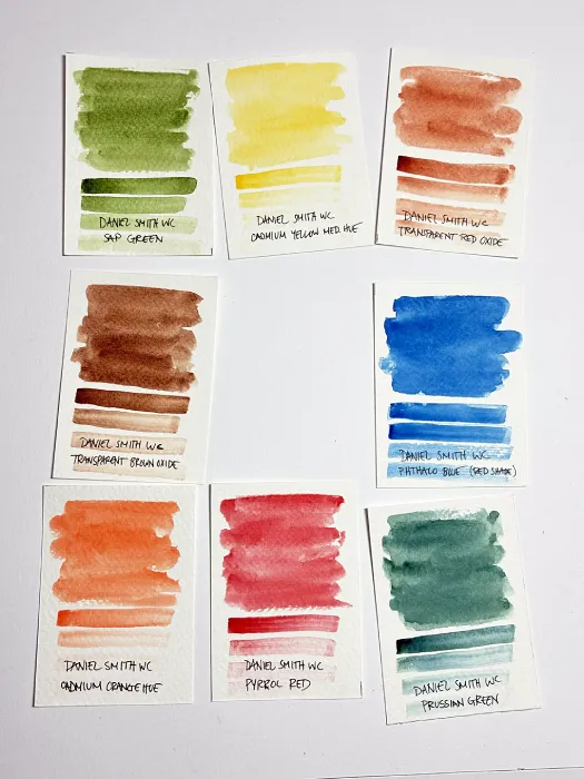
I put the palette together based on these swatch cards, except quinacridone gold because I got it at a different meet and forgot to swatch it with this batch. But you see the vision! What could go wrong?
I got a feel for the colors with a very blobby color study of some trees downtown. I quickly realized I really don't like the Daniel Smith sap green...
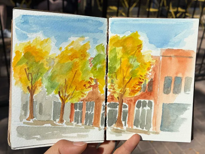
"But you should love sap green, Kale! This specific shade of green is only literally fucking everywhere on your website!" Let me explain.
The trees were a mix of cad yellow, quin gold, and sap green. I was instantly sold on the quin gold because it adds warmth and vibrancy to everything it touches. But the sap green is muted even in its purest state, so it doesn't look right mixed with bright yellow.
I'm also used to muddying my own greens (usually I start with permanent green #1 and gradually add red and blue to it until I get the color I want), so having a pre-muddied green doesn't give me as much control or cohesion with the rest of the colors. It's also harder to get the same variety of greens that I'm used to because the sap green turns brown when mixed with red or orange.
Gripes about sap green aside, I love transparent red oxide for brick because it granulates really intensely, which makes the building look more brick-y with no effort on my part. Adding transparent brown oxide (an equally strong granulator) helps add some tonal variation to different buildings. The transparent brown oxide also made some nice greys with the phtahlo blue. I'm very attached to ultramarine and don't think I'll ever be able to stop using it, but I think the warmth from the phthalo blue works better for this color combination.
The day after that, I decided to give the sap green another shake with a slightly cleaner painting. I love a good maple tree, and this one gave me an excuse to pull out the pyrrol red!
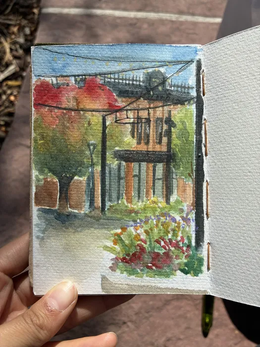
This time, I tried to use the sap green with minimal mixing. It's more successful in isolation, but it looks pretty flat since I didn't make other colors with it. Once again, transparent red oxide is doing a lot of heavy lifting with the brick.
I did yet another painting of trees while I was taking a walk a few days ago.
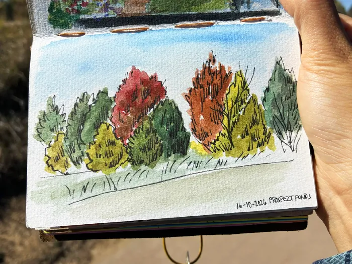
I tried muting the pyrrol red and cad orange with sap green and liked it a lot better as a mixer instead of a base color. On the other hand, I didn't care for what it did to the cad yellow. It came out approximately the color of pickle juice, which I like as a color, but those trees were really more of a saturated lime green. At least it doesn't look bad with the other colors...
I forgot to mention the Prussian green, which is a great evergreen color, but I haven't found a lot of ways to use it otherwise. It's similar to the sap green in that the starting point is very muted, so it's hard to use with other colors. It does mix some nice darks, though, and I imagine I'd have a field day with it in the Pacific Northwest.
My favorite piece with these paints was done last week at the October Urban Sketchers meet. We went to a pumpkin patch, so it was time for cad orange to earn its keep. It didn't disappoint!
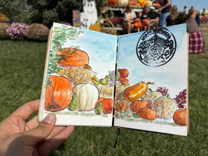
For this, I tried mixing pyrrol red and phthalo blue together to make purple for an underpainting of the shadows. It initially looked pretty bad, but I was too far in to do anything but trust the process. It started looking better once I added a few more layers of color on top. I also thought the sap green worked nicely for the little green accent gourds.
You can see in the photo at the beginning that I've made a sizeable dent in the dots over the last few weeks, but I'm still managing to scrub some paint off of them. I'm not sure that I would have spent my own money on watercolor dots, but I appreciate the reality check about which paints I would actually use a full tube of eventually.