Fude for thought (2)
Last year I managed to get the Sailor Profit Fude de Mannen pen secondhand, and it's my new favorite sketching pen by a large margin.

Drawing of a cat sleeping on a Vespa scooter (from an actual photo my dad took in Italy!)
The pen is actually navy blue, but I screwed the nib section onto the Sailor Compass because I am a shallow person.
I previously tried out a fude nib for the first time with the Sailor Hocoro dip pen. I wanted it as a fountain pen but not enough to be proactive about it until this secondhand posting fell into my lap. For a refresher, fude nibs are bent upward so that you can achieve different line widths by tilting it at different angles. The intended effect is for the strokes to look brush-esque, hence the name "fude," meaning brush in Japanese.
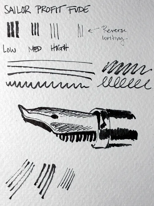
Sampling of the different strokes that the fude nib can produce
As far as I can tell, the Sailor fude nib is a bent version of the Sailor Compass nib. Fortunately it doesn't have any of the ink flow issues that plagued the Compass.

Comparison of the Sailor Compass (left) and Sailor fude (right) nibs
It's not a particularly smooth drawing experience even on untextured paper, so it adds texture that makes everything I do look 50% more interesting by default.

Drawing of a street in Mexico. A car is in the foreground. There are power lines and street lights in the background. A metro car is also in the background.

Drawing of a building on a street corner. It houses a (really big) rock shop now but it's pretty old! I wish I knew more about the history of it.

Drawing of three men eating at a diner counter. I drew this from a photo because I felt weird drawing these people in the middle of a busy restaurant...
The previous drawings were done with Sailor Manyo Shirakashi. I love that ink, but I don't think it does the fude pen any favors because everything looks streaky and uneven. The next drawing (and the one with the Vespa at the beginning) was done with the stock black ink cartridge that comes with the pen. I mentioned in the Compass review that Sailor black ink is very wet, and it has more contrast against the yellow paper.

Drawing of three people sitting by a lake. There are some plastic cups behind them. All of them are facing away from the camera and looking out at the lake and surrounding trees, which are represented mostly through loose scribbles here.
The Sailor Profit Fude is no longer available, but I'm pretty sure the same nib is being sold in the Sailor Fude de Mannen now. They're relatively inexpensive and definitely easier than waiting for a used pen to appear online.